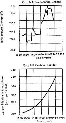
16. According to the diagram at right, which of the following
is the best interpretation of the data in the graphs? The amount of carbon dioxide
in the atmosphere
Answer: Answer a. The amount of
carbon dioxide has increased steadily, and the temperature on the Earth has
shown an overall increase. (It couldn't be answer b because the Earth's temperature
has not shown a steady increase.
 ---------- ----------

Slichter