[IB Biology First Year HL at GHS: Ecology]
Age Structure & Population Trends

The percentage of males and females at each age level (in this case, 20 year increments) in a population can be represented as a bar graph. The age structure graph above shows the percentage of males at each age level on the left while the percentage of females is on the right. In this population, the bulk of the population is young, meaning that the population size may soon increase as the large number of young tortoises reaches reproductive age.
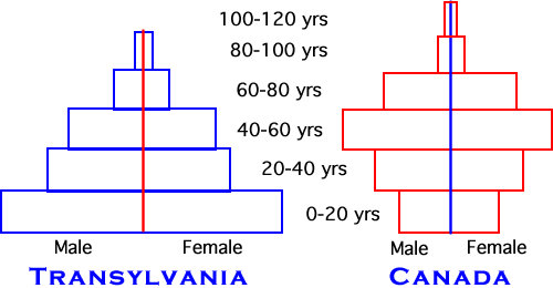
Comparing the two graphs above, Transylvania has a larger young population than Canada. Transylvania may see an increase in its population size as its youngsters come of reproductive age (especially if attempts to control population size do not take place.......contraceptive methods, rhythmn method, etc...). Canada has a lower percentage of its population as young people and would likely begin to see a reduction in population size.

The population age structure graph shown above shows a stable population with all age levels roughly comprising the same percentage of the whole population. The population is probably not growing or decreasing in size.
Slichter