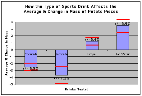
The red bars indicate the range of the standard deviation for each type of drink. The ranges of data for powerade and gatorade overlap, so those data are too close to absolutely determine which hydrates the least. The differences between tap water and propel are sufficient to conclude water hydrates better than propel, and the conclusion that both hydrate better than powerade and gatorade can be made.